Logistic regression example 1: survival of passengers on the Titanic
One of the most colorful examples of logistic regression analysis on the internet is survival-on-the-Titanic, which was the subject of a Kaggle data science competition. The data set contains personal information for 891 passengers, including an indicator variable for their survival, and the objective is to predict survival, or probability thereof, from the other characteristics. This page demonstrates an analysis of the problem in Excel using RegressItLogistic. The data and accompanying models are provided in this file: Titanic_logistic_models.xlsx. Some recoding and renaming of the variables in the original data set has been performed here. The survival data for all passengers is stored in the binary variable called Survived, and the variable called Survived1st800, which will serve as the dependent variable in the models, has the same data except with the last 91 values removed for purposes of out-of-sample testing. The predictors include Sex (modeled with male/female dummy variables), Age (and additional dummy variables for ranges), Class (first, second, or third, modeled with dummy variables), SiblingSpouse (number of siblings and spouses accompanying the passenger, and corresponding dummy variables), ParentChild (number of parents and children accompanying the passenger, and corresponding dummy variables), and Embarked (ports of Cherbourg, QueensTown, and Southampton, modeled by dummy variables). In the accompanying data set, text versions of the categorical variables are also included for descriptive use in pivot tables in Excel. Another variable that appeared in the original data set, ticket fare, has not been used here.
In the analysis file, models have been fitted to Survived1st800, with out-of-sample testing performed for the additional values in Survived. The picture below shows the control panel for the logistic regression procedure with a specification of the final model out of four that were tried with successive refinements. Some descriptive analysis with pivot tables was first performed to identify good candidates for independent variables, leading to the exclusion of some dummy variables due to irrelevance or small samples as well as to the creation of a few additional variables for interaction effects. (For example, the most important age effect was the fact that males less than 10 years in age were much more likely to survive than other males.) The first three models that were fitted to the good candidates were given the default names Model 1, Model 2, and Model 3, and they were produced with minimal output. The final model was given the custom name "Titanic logistic model" and most of the output options were chosen for it. Like the linear regression procedure, the logistic procedure has built-in documentation (click the plus signs for details of the options) as well as optional teaching notes that can be embedded in the model output worksheet. Custom labels for positive and negative outcomes can be entered for use in table and chart titles and legends. Here the labels “Dead” and “Alive” have been entered.
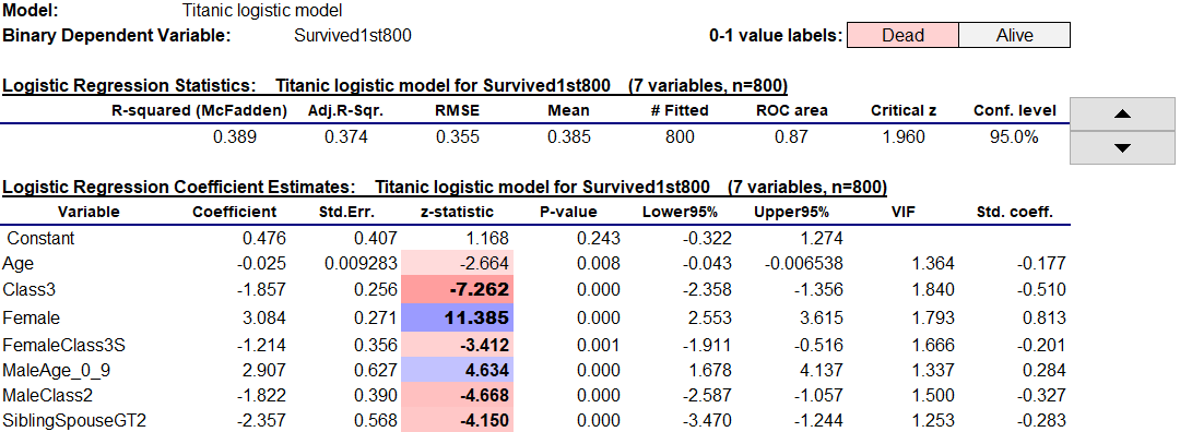
The summary statistics and coefficient estimates for the model are shown at the top of the worksheet. Their tables have the same general layout as those of the linear regression procedure, including interactive control of the confidence level and interactive use of colors and font boldness to highlight significance of coefficients and their standardized values. Here this dramatizes the fact that being female and not being in class 3 were the two most important factors in favor of survival.
As in the linear regression version of the program, you can use the Filter and Remove buttons on the RegressIt ribbon to interactively sort the variables in the coefficient table on the basis of P-value (or any other statistic) and flag insignificant ones for deletion from the next model launched from this sheet. This makes it very easy to refine a model by backward stepwise selection (working in blocks of variables if desired) while keeping yourself engaged and in control at each step.
The model equation in text form is also included (hidden by default when the worksheet is first displayed), and for instructional purposes it shows the details of how the logistic transformation of a linear equation is used to make predictions in units of probability:
The model equation in text form is also included (hidden by default when the worksheet is first displayed), and for instructional purposes it shows the details of how the logistic transformation of a linear equation is used to make predictions in units of probability:
Exponentiated coefficients, which show the impact of the variables on predictions expressed in units of (unlogged) odds, can be optionally included. The exponentiated coefficient of a variable is the factor by which the predicted odds in favor of a positive outcome are increased per unit of change in that variable, holding other variables fixed (if that is logically possible). For example, the exponentiated coefficient of 0.095 for the dummy variable SiblingSpouseGT2 indicates that the predicted odds of survival of passengers accompanied by more than 2 siblings or spouses are only about one-tenth as great as that of other passengers, other demographic factors being equal.
The standard output of a logistic model includes an analysis of deviance table, which takes the place of the analysis of variance table in linear regression output. The quantity minus-two-times-the-log-likelihood is compared between the fitted model and a null (constant-only) model, and the difference between these numbers (the regression deviance) is the basis of a Chi-square test for the overall significance of the model, analogous to the F test for a linear regression model. The table also includes the Akaike Information Criterion (AIC), a widely used model-comparison statistic which is based on the log likelihood with an adjustment for the number of model parameters, as well as the area under the ROC curve (more about this below).
In addition, the table includes three different versions of R-squared. There is no universally accepted way to define R-squared for a logistic model, because the usual definition in terms of explained and unexplained variance is not an appropriate measure of goodness of fit to binary data. The values of the three different R-squared measures are calculated with live formulas so you can see how they are defined. McFadden's formula is closest in spirit to that of the usual one, directly substituting log likelihoods for variances.
The correlation matrix of coefficient estimates uses the same interactive color coding that is applied to correlations elsewhere.
The classification table shows how the model performs in making binary predictions, and it allows interactive manipulation of the cutoff level. The spinner at the right of the table allows you to adjust the cutoff level up and down to find a value that yields the best performance in terms of the percentages of correct predictions and true positive and true negative rates. You don’t have to re-run the models with different cutoff values to see what will happen. The spinner changes the cutoff value in increments of 0.05, but you can also type in other values in increments of 0.01.
How does the interactive table work? Its underlying detail data is stored in much larger table off to the right, outside the default viewing area, where it is available for closer study or copying to other locations. The same is true for the other interactive tables and charts described below. So, there is a lot more output on the worksheet than you see at first glance.
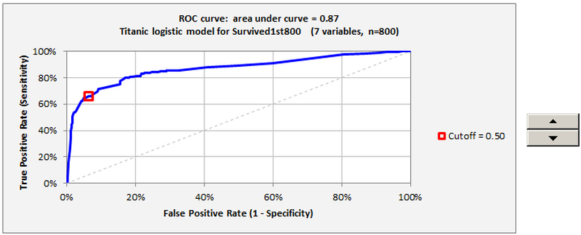
The Receiver Operator Characteristic (ROC) chart, a key piece of output that maps out the model’s classification accuracy over the whole range of cutoff values, is also interactive. (This colorful term derives from the original use of such charts in evaluating the enemy-detection capability of radar receiver systems in World War II.) You can manipulate the cutoff value with the spinner to the right of the chart and see where in the curve it puts you. The area under the curve, which has a maximum possible value of 1 for a model with perfect classification accuracy (and a value of 0.5 for one that always makes the same prediction), provides a measure of the model's all-around performance in binary classification.
The Receiver Operator Characteristic (ROC) chart, a key piece of output that maps out the model’s classification accuracy over the whole range of cutoff values, is also interactive. (This colorful term derives from the original use of such charts in evaluating the enemy-detection capability of radar receiver systems in World War II.) You can manipulate the cutoff value with the spinner to the right of the chart and see where in the curve it puts you. The area under the curve, which has a maximum possible value of 1 for a model with perfect classification accuracy (and a value of 0.5 for one that always makes the same prediction), provides a measure of the model's all-around performance in binary classification.
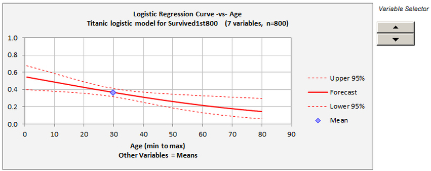
The logistic curve plot allows you to interactively select an independent variable against which to plot the predicted probability of a positive outcome, holding other variables fixed at their mean values, and the confidence bands are interactively controlled by the buttons on the ribbon as in the case of linear regression:
When plotted over a wide enough range of values for the independent variable, the curve is S-shaped or reverse-S-shaped. If the independent variable does not have a very significant effect on the predictions as it varies between its lower and upper bounds in the data set, only a portion of the S or reverse-S will be visible in the plot, as is the case here. The confidence limits shown on this plot reflect uncertainty about the true probability of the event for given values of the independent variables. They are analogous to what are called "confidence limits for means" in a plot of forecasts generated from a linear regression model, i.e., confidence limits for the height of the true regression line rather than confidence limits for predictions. In linear regression analysis, there is assumed to be normally distributed noise in the data whose standard deviation is an additional parameter of the model, and its estimated value is the standard error of the regression. In logistic regression analysis there is no such additional parameter: noise in the data arises from the random generation of 0's and 1's according to the true values of the event probabilities. An RMSE statistic is included in the output, but it does not represent an estimate of the intrinsic accuracy of the model. Rather, it also reflects the extent to which the given data sample contains values for the independent variables that are far enough away from their respective means to yield nontrivial predictions.
One of the important program features is the ability to make out-of-sample forecasts and validate them on a set of hold-data, i.e., to separate the data into a “training” set and a “test” set and compare the model’s performance on them. The way to use this feature is to have two copies of the dependent variable, one that includes only the training values (i.e., which has blank cells in the rows that are to be held out for testing) while the other includes the test data (with or without the training data). The independent variables must have values present for both sets. When this feature is used, both an in-sample classification table and an out-of-sample classification table and forecast table are produced. In all of them the cutoff value can be interactively manipulated to explore its effect on error rates and also to show how binary predictions for individual cases in the test set are affected, e.g., who is predicted to live and who is predicted to die in the Titanic example:
One of the important program features is the ability to make out-of-sample forecasts and validate them on a set of hold-data, i.e., to separate the data into a “training” set and a “test” set and compare the model’s performance on them. The way to use this feature is to have two copies of the dependent variable, one that includes only the training values (i.e., which has blank cells in the rows that are to be held out for testing) while the other includes the test data (with or without the training data). The independent variables must have values present for both sets. When this feature is used, both an in-sample classification table and an out-of-sample classification table and forecast table are produced. In all of them the cutoff value can be interactively manipulated to explore its effect on error rates and also to show how binary predictions for individual cases in the test set are affected, e.g., who is predicted to live and who is predicted to die in the Titanic example:
The forecast table shows the predicted probabilities and their confidence limits, as well as binary predictions based on the currently selected cutoff level in the out-of-sample classification table. The corresponding binary predictions are shown in text form, using the custom labels (if any) that were specified, and they are also color-coded for dramatic effect. Play with the cutoff level on this worksheet to see what is predicted to happen to whom!
The linear regression procedure is also included in this version of the program, although the menu of output options is organized a little differently from the one in the PC/Mac linear-only version. In addition to producing different-looking model output worksheets, the linear and logistic procedures have different summary statistics that are recorded on the Model Summaries worksheet. The output statistics of a logistic model look like this, and they include out-of-sample error results if present, so that different models can be compared side by side in their performance on both the training data and test data, and this also adds detail to the audit trail. In this example, out-of-sample forecasts were generated only for the final model.
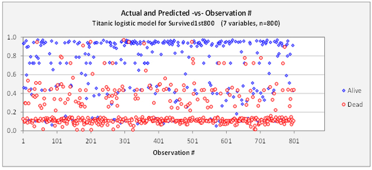
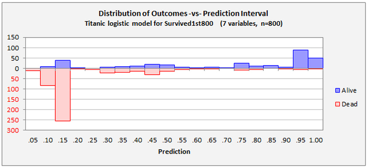
Four additional diagnostic charts can be produced. The following two provide different views of the distribution of the model's errors versus predicted probabilities. The first chart shows the probability of a positive outcome that was predicted in each row of the data set, and the point symbols indicate the actual outcomes. The second chart is obtained by rotating the first chart 90 degrees clockwise and then letting the red and blue symbols fall down into bins of width 0.05. The first chart gives a visual impression of how the model is performing on a case-by-case basis, and it reveals whether there is some systematic ordering of the rows in the data set with respect to the values of the variables. In this example there isn't.
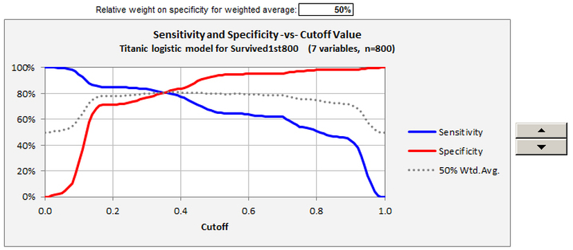
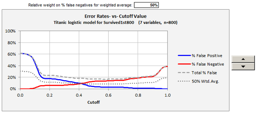
The final two charts provide different views of the model’s error rates versus the cutoff level, and they allow interactive manipulation of a weighting factor applied to the two kinds of error. The first chart, sensitivity and specificity versus cutoff value, also provides a detailed view of the X-Y data that is underneath the ROC curve
Click here to proceed to the GLOW example.
Click here to proceed to the GLOW example.


