Logistic regression
RegressItLogistic (which runs on PC's only) performs both linear and logistic regression analysis in Excel. You can download it here. It has the same ribbon and menu interfaces as RegressItPC and RegressItMac and the same presentation-ready table and chart design, but with additional analysis tools and output options that are specialized for logistic models. Like the other two versions of the program it can also generate and run R code for linear and logistic regression, so you can run a logistic model in R that you have specified in RegressIt in a matter of seconds, and it will create output in both RStudio and Excel. This feature allows much larger data sets to be analyzed and offers additional options for cross-validation, and it can be used without knowledge of R programming.
RegressItLogistic (which runs on PC's only) performs both linear and logistic regression analysis in Excel. You can download it here. It has the same ribbon and menu interfaces as RegressItPC and RegressItMac and the same presentation-ready table and chart design, but with additional analysis tools and output options that are specialized for logistic models. Like the other two versions of the program it can also generate and run R code for linear and logistic regression, so you can run a logistic model in R that you have specified in RegressIt in a matter of seconds, and it will create output in both RStudio and Excel. This feature allows much larger data sets to be analyzed and offers additional options for cross-validation, and it can be used without knowledge of R programming.
The logistic version of RegressIt has interactive table and chart output which you will not find in other software. These features have been built into the program because often one of the objectives of logistic regression analysis is to explore tradeoffs between the two kinds of classification error--false positives and false negatives--and it is helpful to have immediate visual feedback when doing so. These tradeoffs are relevant to the choice of an appropriate "cutoff value" for converting probabilistic predictions into categorical predictions when needed. More generally the table and chart designs help you to visualize your data and to better understand the complex mathematical properties of a logistic model and to be prepared to illustrate them in front of others in a teaching or consulting environment. These features are demonstrated in two examples on the web pages that follow. One example is an analysis of the famous Titanic data set that was the subject of a Kaggle data science competition. The other example is an analysis of the GLOW data set that is studied in detail in the classic textbook of logistic regression by Hosmer and Lemeshow, with a reformulation of their model to clarify its inferences. The accompanying notes on logistic regression (pdf file) provide a more thorough discussion of the basics, and the model file is here.
For those who aren't already familiar with it, logistic regression is a tool for making inferences and predictions in situations where the dependent variable is binary, i.e., an indicator for an event that either happens or doesn't. For quantitative analysis, the outcomes to be predicted are coded as 0’s and 1’s, while the predictor variables may have arbitrary values. An ordinary linear regression model is inappropriate in this situation. You can try it, but the results are often illogical or inapplicable. The errors of a linear regression model fitted to binary data cannot be normally distributed nor identically distributed for all values of the predictions, the predictions and confidence limits can stray outside the unit interval, and such a model is incapable of finely discriminating among probabilities that are close to 0 or 1, which can be important in situations where there are small but non-zero chances of events with large consequences.
A logistic regression model approaches the problem by working in units of log odds rather than probabilities. Let p denote a value for the predicted probability of an event's occurrence. The corresponding log odds value is LogOdds = LN(p/(1-p)), where LN is the natural log function. The inverse relationship is p = EXP(LogOdds)/(1+EXP(LogOdds)) where EXP is the exponential function. As the value of p goes from 0 to 1, the corresponding value of log odds goes symmetrically from minus infinity to plus infinity, and vice versa. A probability of 1/2 corresponds to a log odds value of 0, and in general the log odds value for probability p is minus the log odds value for probability 1-p.
In a logistic model, a linear equation is used to generate predictions and confidence limits in units of log odds, which are converted back to units of probability by the formula above. The predicted probabilities for the binary dependent variable (and their associated confidence limits) smoothly approach 0 and 1 as values of independent variables go to their own extremes. If you plot the predictions against a single continuously-distributed independent variable while holding the others fixed, you see an S-shaped or reverse-S shaped "logistic curve."
In some applications of logistic regression the objective of the analysis is to come up with a model to generate a predicted probability of the dependent event under a given set of values for the independent variables. In other settings the objective is to make categorical predictions: a definite 1 or a definite 0 in each case. Usually this is done by adding one more parameter to the model: a cutoff value. If the predicted probability of a positive outcome is greater than the cutoff value, it is categorically predicted to be a 1, otherwise 0. The chosen cutoff value ought to depend on the relative consequences of type 1 and type 2 errors (false positives and false negatives), although a value of 0.5 is often used by default.
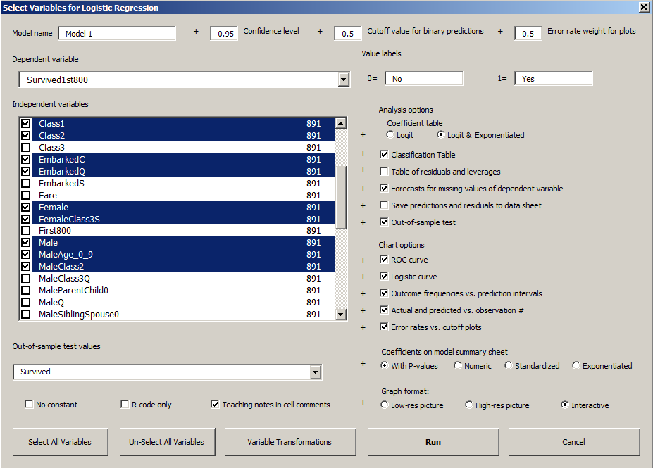
Model summary tables at the top of a logistic regression output worksheet look very much the same as for a linear regression model, including a number called R-squared, a table of coefficient estimates for independent variables, an analysis-of-variance table, and a residual table. Many other outputs are specialized for logistic regression, including classification tables that show the model's performance in making binary predictions based on a cutoff value as well as a variety of specialized statistics and charts that help you to visualize and test the model's assumptions. These are illustrated in the examples that follow and in the accompanying Excel files on the download page. A picture of the logistic regression dialog box for a model fitted to the Titanic data is shown below.
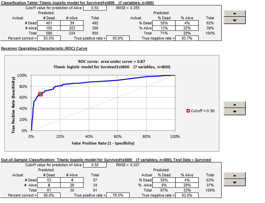
A novel feature of RegressItLogistic is that nearly all of the tables and charts in the logistic regression output have interactive outputs that are controlled with spinners. See the second picture below for an example of the spinners that control the cutoff value in the classification tables and the ROC chart. It is very instructive to see how the location of the point on the ROC curve responds to manipulation of the cutoff level.
The model specifications and some key outputs for the Titanic example are shown below. Click here to go to the page with the complete analysis.
The data can be separated into a training set (fitted values) and a test set (out-of-sample forecasts), and separate interactive classification tables ("confusion matrices") are produced for each. In this example the training set consists of the first 800 rows (for which the dependent variable is called "Survived1st800", which has missing values in the remaining rows) and the test set consists of the last 91 values (for which the dependent variable is "Survived", i.e., all-other).
The "spinners" on the output worksheet (the up and down arrows on the right side) can be used to interactively adjust parameters such as the cutoff values in the classification tables and ROC chart and the confidence levels and relative weights on type 1 and type 2 errors in other tables and charts. You can watch how the numbers change in the classification tables and how your position on the ROC curve slides up and down as you vary the cutoff level by twiddling the spinners. This provides a very nice demonstration of the model's properties for use in a lecture or discussion, and it helps to break out of the mindset of always using a cutoff level of 0.5 merely because that is the default offered by most software. (With most other software you have to re-run the whole model to try a different cutoff level, and there is usually no marker on the ROC curve to show your position for the current cutoff level.)
The "spinners" on the output worksheet (the up and down arrows on the right side) can be used to interactively adjust parameters such as the cutoff values in the classification tables and ROC chart and the confidence levels and relative weights on type 1 and type 2 errors in other tables and charts. You can watch how the numbers change in the classification tables and how your position on the ROC curve slides up and down as you vary the cutoff level by twiddling the spinners. This provides a very nice demonstration of the model's properties for use in a lecture or discussion, and it helps to break out of the mindset of always using a cutoff level of 0.5 merely because that is the default offered by most software. (With most other software you have to re-run the whole model to try a different cutoff level, and there is usually no marker on the ROC curve to show your position for the current cutoff level.)
Click here to proceed to the Titanic example.


