Descriptive Data Analysis
The data analysis procedure can be used to generate descriptive statistics, time series plots, correlation matrices, and scatterplots of some or all pairs of variables. All of the output is organized on a single worksheet, and every chart is a separate object that can be moved, re-sized, and/or copied and pasted to other documents. When the default keep-graph-links-live option is used, all of the chart features (titles, point and line formats, colors, etc.) are subject to editing with Excel's usual charting tools. There is an option to choose the variable to list first in the descriptive statistics table and correlation matrix and chart arrays in order to focus on a particular variable of interest (e.g., the variable to be predicted).
The sample data file for this demonstration (which is available here) contains 52 weeks of price and sales data for 3 carton sizes of beer at a small chain of supermarkets. The price and quantity-sold variables have all been converted to a per-case (i.e., per-24-can) basis to allow prices and quantities to be directly compared in charts and model coefficients. For example, the value of $19.98 for the price of 12-packs in week 1 means that a 12-pack sold for $9.99 in that week, and the value of 223.5 for cases of 12-packs sold in that week means that 447 12-packs were sold.
The following analysis specifications were used to generate the tables and charts shown below on this page. The analysis name "Statistics of sales and prices" was entered in place of the default "Data Analysis 1".
The descriptive statistics table at the top of the output worksheet shows the usual summary stats, with numbers formatted to fit the scale of the values:
The optional series plots are especially important for time series data. Here they show dramatic increases in sales in weeks when the price of a given size carton is reduced.
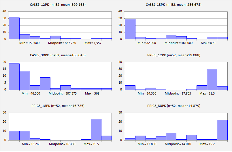
The histogram plots provide another view of the pattern that is evident in the series plots, namely that in many weeks sales were near the bottom of their range and prices were near the top of their own range.
In the correlation matrix, column headings are staggered down the diagonal to allow long descriptive variable names, and colors and font shading can be used to highlight the relative magnitudes of values. Here it is seen that the strongest correlations are the negative correlations between sales of a given size carton and its own price, which was also apparent in the series plots. There are also weak positive correlations with prices of the other size cartons.
A full 6x6 matrix of scatterplots was generated in this analysis. The upper right 3x3 portion, in which quantities are plotted against prices, is shown below. Each of these scatterplots includes the optional fitted regression line and the optional mean value point (the center of mass of the data) as specified in the dialog box. The chart title shows the correlation and its squared value. (The slope of the line could have been shown instead of the squared correlation.) Axes are scaled so that the upper and lower limits are the minimum and maximum values of the variables in order to spread the points out as much as possible and to record additional statistics of the variables directly on the chart. Each of the scatterplots is a separate, native Excel chart that can be enlarged, edited, and/or copied to a new sheet.
Click here to proceed to the next page: Regression.
Click here to proceed to the next page: Regression.


